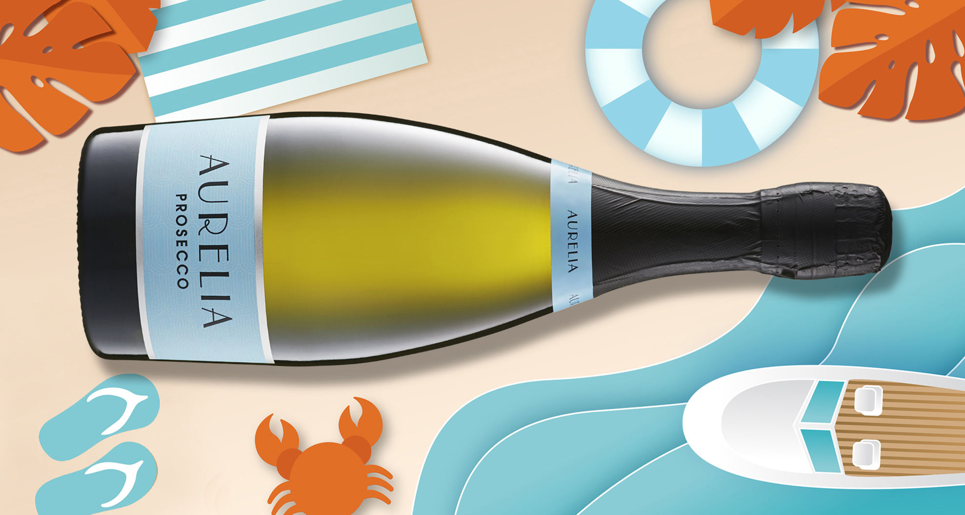
In close collaboration with the team at Robert Oatley Wines, there was a clear vision for the new Aurelia Prosecco project. The design and sensory experience of the packaging needed to embody a fresh, modern Italian elegance that captured the essence of the wine. Research into the existing brand name and the inherent nature of Prosecco wines, the CoLLECT team drew their inspiration from the 1920s jazz age. This was a time characterised by glamour and opulent escapades, much like we saw in the Great Gatsby. Exploration of the cool blue colour palette conjured up images of long days at the beach, cool glasses of bubbles at summer garden parties and crazy adventures of a bygone era. The resulting label design features an elegant Art Deco pattern that fills the canvas, with subtle silver foil detailing, bringing together the brand story we had set out to achieve. To enhance the sensory appeal, embellishments of embossed lettering on a textured spot matt-varnished stock were added in consultation with the printer. The inclusion of an elegant neck label was the perfect accessory to add balance and harmony, finishing off the package. The result is luxurious and fresh, with just enough retro to deliver contemporary appeal.
scope | brand strategy, wine label and packaging design